Background
Yahoo Mail explorations based on the concept of “Mail as a personal media folder“.
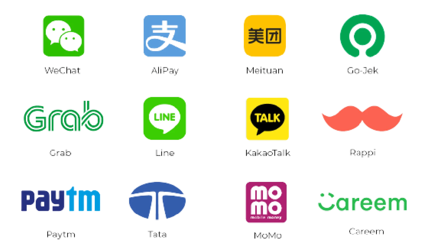
Super App successful cases
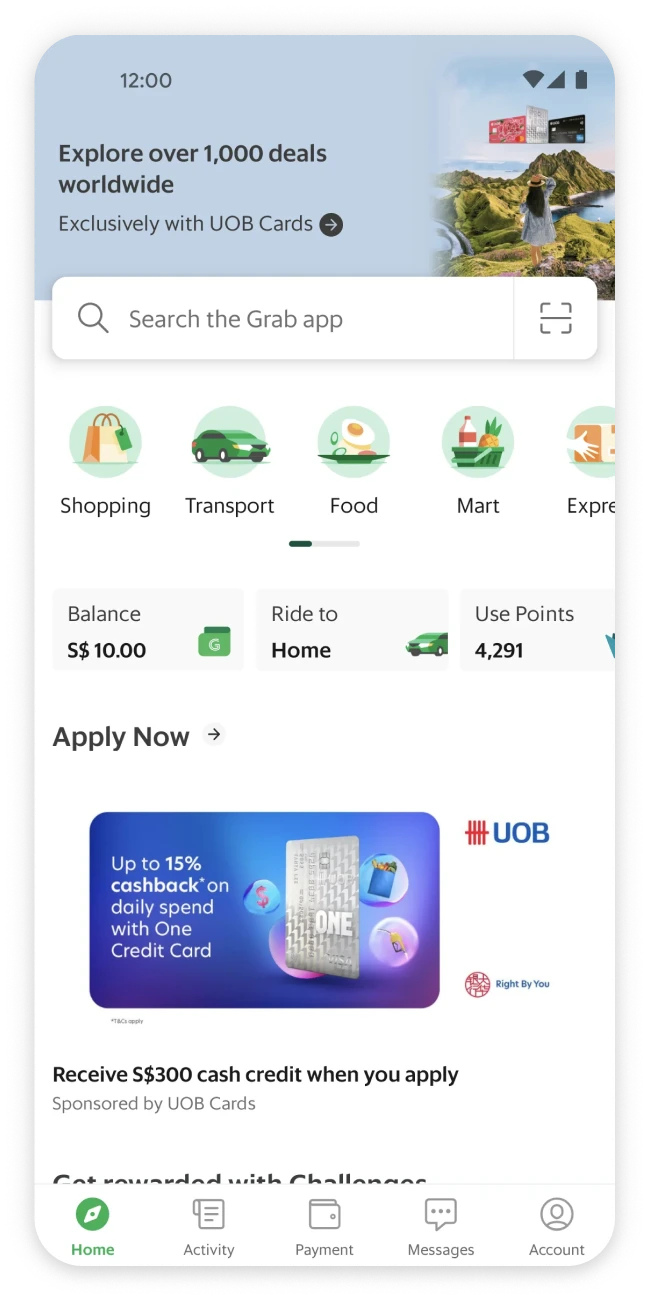
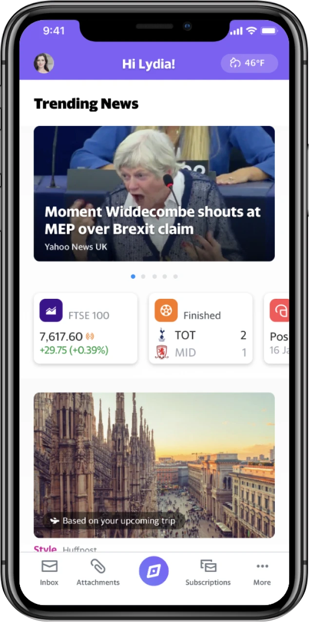
Grab App: Home page
Business Goal
Design Goal
My Contribution
Outcomes
30
52.5%↑
89%


Rolling Research
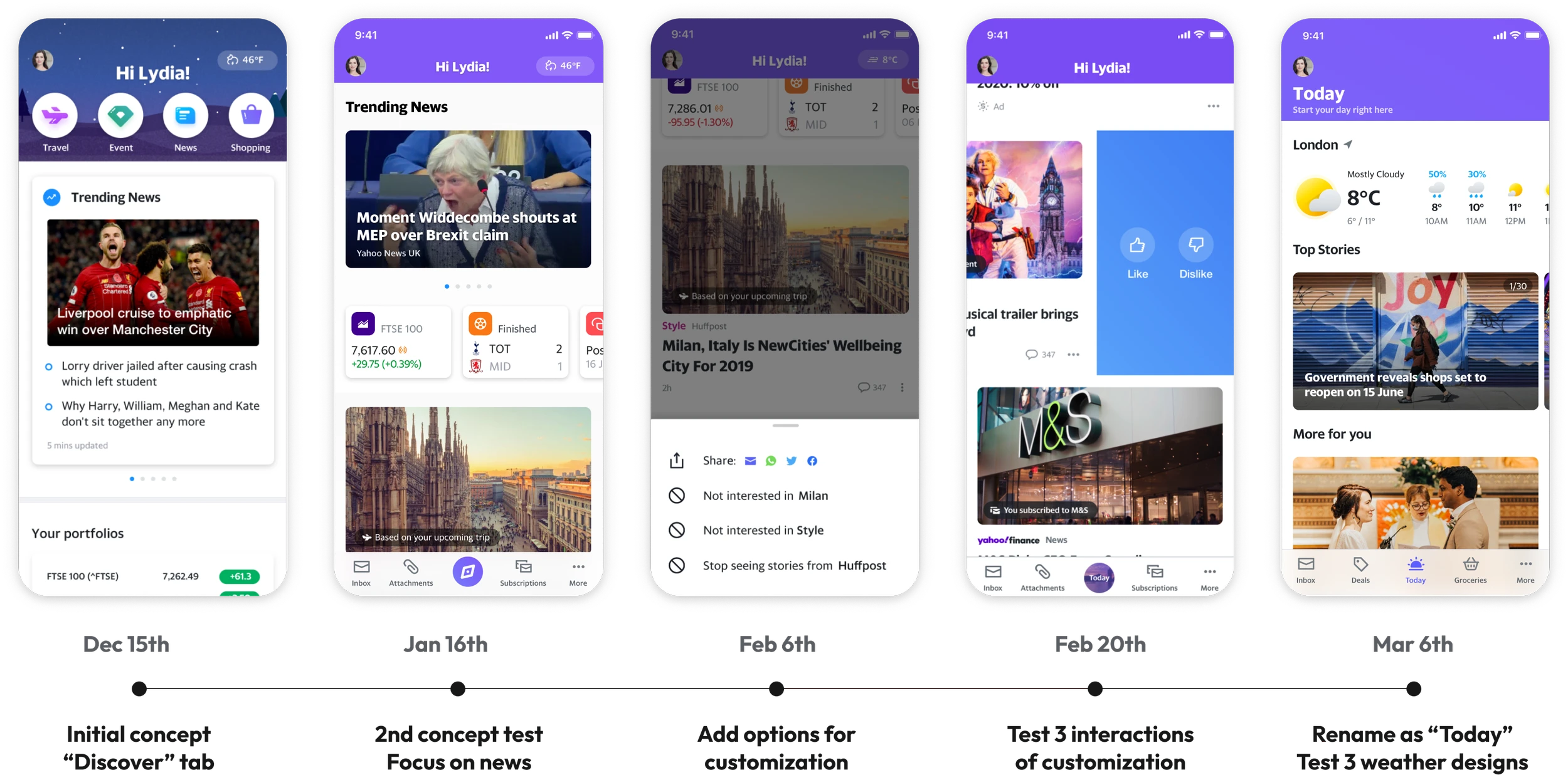
Design iterations throughout the study.
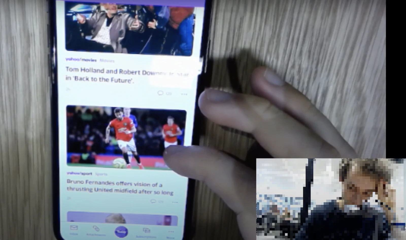
The interview was conducted in the UK remotely.
Key Design Decision #1
From the first interview, users consistently expressed a need for control over what appeared in their content feed. Because Mail is inherently personal, users expected Today Tab to feel personal as well.
To understand what level of control would best meet that expectation, I designed three prototypes that tested different customization models: liking or disliking articles, controlling news sources, and adding favorite topics.
User Need I heard
"Is there an option where you can change what you receive and what you see?"
Prototype A
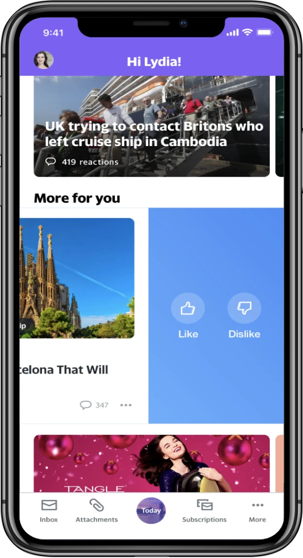
Like or dislike
User Need I heard
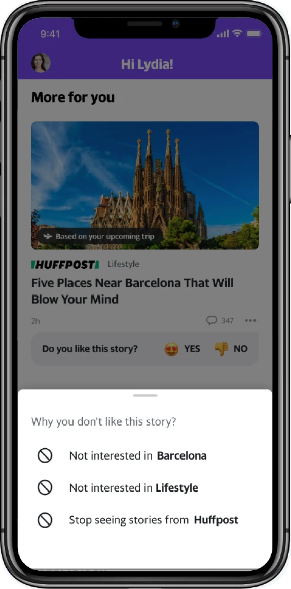
“I want a way to say I never want to see that publication.”
Prototype B
Control over news sources
User Need I heard
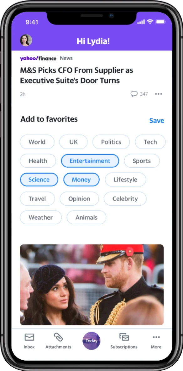
“[I am] sick of sports and politics. I don’t want disasters and killings. But I’d love to see something make me feel nice. A big event. A nice offer. A nice place to go...”
Prototype C
Add favorite topics
Prototype B best matched user expectations, as users repeatedly said they wanted the ability to block specific publishers, articles, politicians, celebrities, or topics. Based on this finding, I focused the MVP on content controls that gave users a clear way to shape their feed without adding too much complexity.
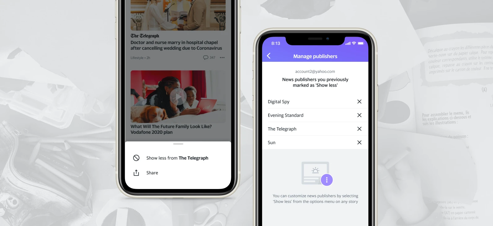
Users can manage and block specific news publishers from their content stream.
Key Design Decision #2
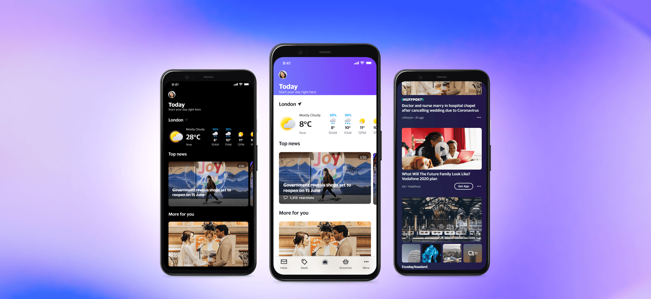
In our initial design, weather was just a small entry point to the Yahoo Weather website. However, during early research sessions, participants consistently described weather as an essential part of their daily routine. This showed us that weather could serve as a practical daily utility alongside news content. I partnered with the researchers to explore weather modules with different sizes and interaction patterns.
Prototype A
Shortcut on navigation bar
User Testing Result
Users struggled to find content due to small text size and couldn't get enough weather details.
Prototype B
Expandable utility module
User Testing Result
Users wouldn't interact with the expandable module and missed the weather details.
Prototype C
Detailed weather card
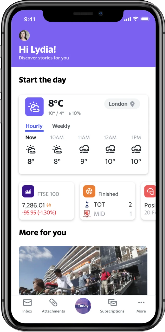
User Testing Result
Users appreciated the detailed weather information but wanted to see precipitation forecasts as well.
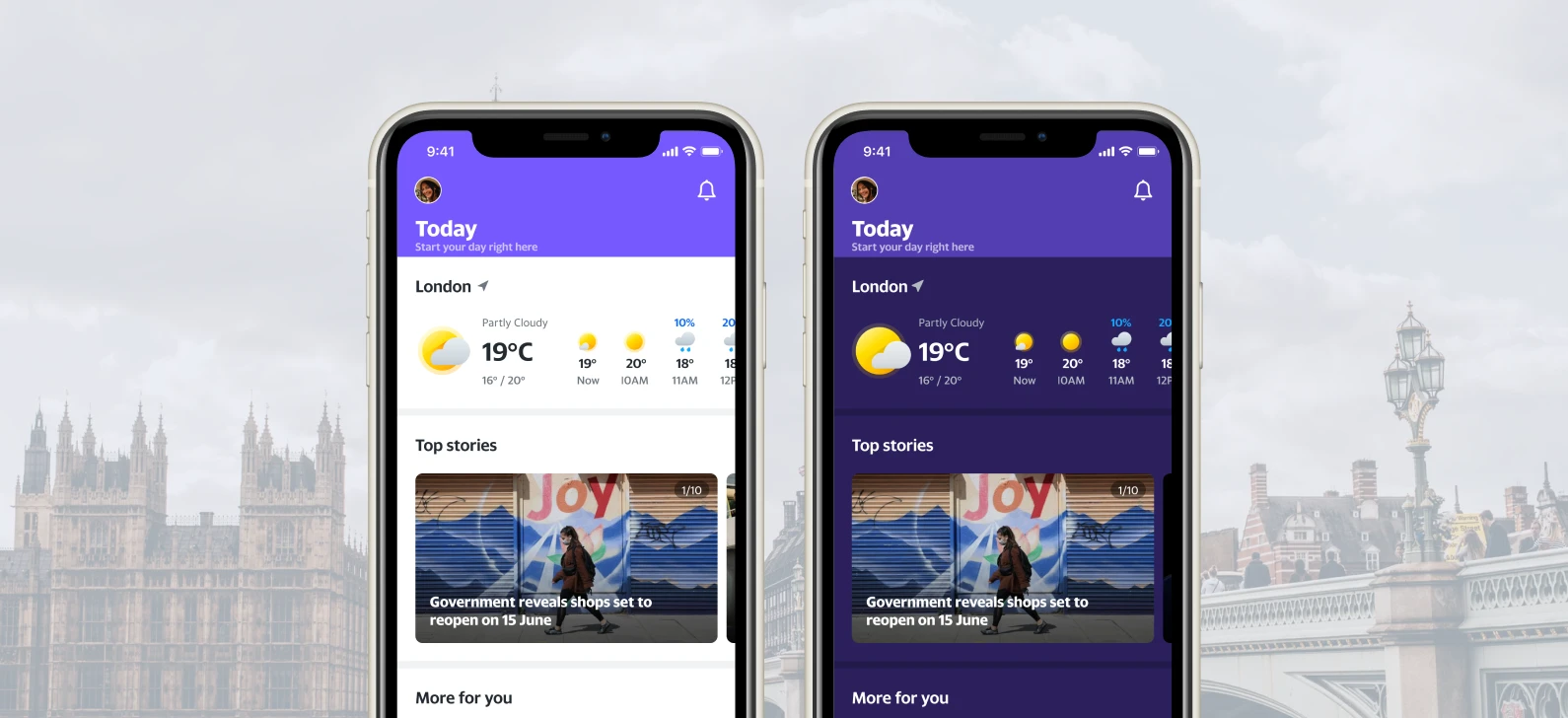
A compact, scrollable weather module on top of the Today tab.
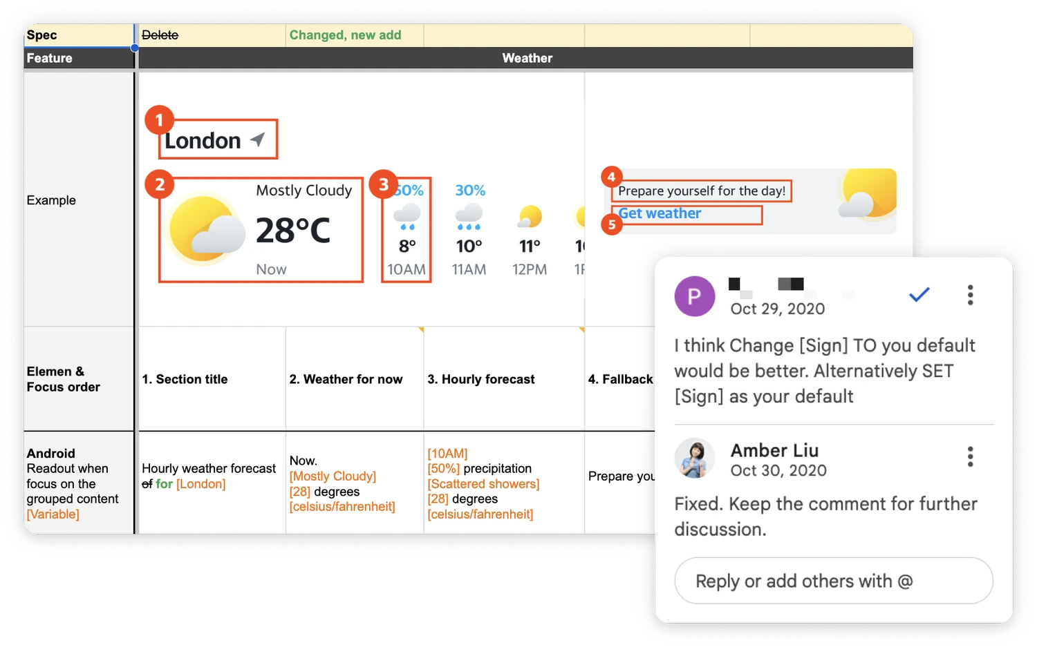
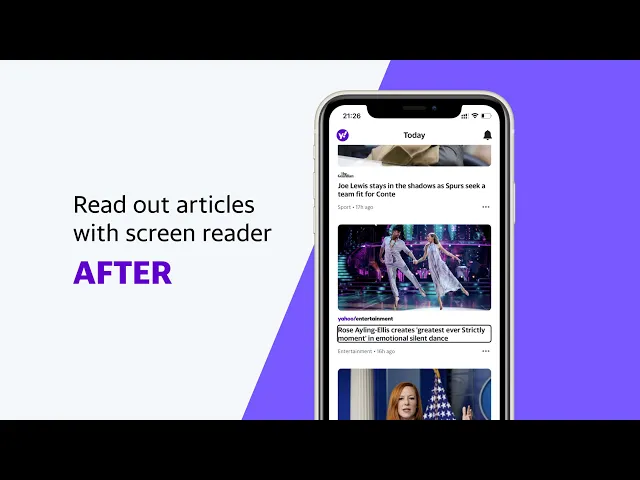
I used Google Spreadsheets as the shared document.
Defining focus states and readout behavior.